Leslie Dewberry
ui/ux designer

Kermin
APP UI UX
A product for caregivers and young, curious minds.
Multitasking is inevitable for caregivers of young children these days. There are just too many tasks with too little time to complete them. So parents often attempt to fulfill their responsibilities while listening to their kids hoping they stay out of trouble.
The result is not always a success.
The Kermin app provides engaging, creative, and critical-thinking activities to children so that caregivers can accomplish their day-to-day commitments without being fearful of what their little ones are getting into.
This ultimately leads caregivers to have more patience and mental bandwidth to spend quality time with their little ones.
Roles
I assumed the following roles in this project:
-
Research
-
User Experience (UX) Design
-
User Interface (UI) Design
-
Graphic Design
Tools
I used the following software on the following projects:
-
Figma
-
Adobe Illustrator
-
Adobe InDesign
-
Adobe Photoshop
Deliverables
Interaction Design:
High-fidelity interactive prototypes for key tasks on iOS
UX/UI Design:
-
Competitive analysis
-
User surveys and 1:1 interviews
-
Personas
-
Task flows
-
Sitemap
-
Low-fidelity wireframes
-
High-fidelity mockups and prototypes
-
Usability tests and findings

How might we engage growing, young minds in order to help busy caregivers successfully complete everyday tasks with less stress?
––
Research, Findings,
and Design Approach
-
My research first centered around finding other apps that addressed similar issues. Many of the existing apps I found and tried were busy, complicated, and text-heavy which would be especially problematic for younger users.
-
I also researched educational programs and case studies to gain knowledge about the psychology and physiology of a young, growing brain paying special attention to how we learn and think as children.
-
I gained great insight into the methods parents were using to balance their time, energy, and focus between work and raising children by sending user surveys via social media and email. By compiling those responses, I was able to quantify what parents were spending in an effort to resolve this problem.
-
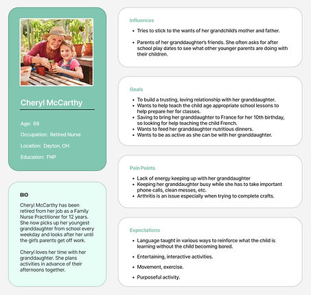
I conducted one-on-one interviews with a number of caregivers with children between the ages of four and 11 to better understand their day-to-day struggles, how they’re currently handling those struggles, their motivations, and their goals. I discovered that many caregivers reiterated notably similar wants and needs despite their child's age.

Fun facts:
––
Children remember and respond to colors much easier than verbal cues, so we can use color to help kids learn and retain information.
1
––
The color orange can increase a child’s ability to learn by naturally boosting brain activity and attracting their attention to details.
2
––
Sketches and Wireframes
I kept my initial layouts much more condensed and simplistic so that younger users may be able to easily focus and not feel overwhelmed. I used these sketches to complete Guerrilla Testing on a few potential users and gain initial feedback on whether or not the simplistic layout was understandable.
After completing a few iterations of the layout based on feedback from testing, I recreated my final sketches into low-fidelity wireframes and wireflows.


These clickable wireframes were then tested again which brought to light a few more ways to improve the app such as using clearer word choice, the ability to add multiple players under one parental account, and the option to add a custom avatar.
––
Mood Board
Since researching the learning habits and affinities of a child’s brain at the start of this journey, I had already been doodling logo ideas and ruminating about color options and the imagery style I would incorporate into the design. So finalizing the logo and pulling together a mood board for the app was a fairly quick task.

––
Style Guide
With most of the design decisions complete, I produced a style guide incorporating the images, colors, typeface, and most of the app's components.

––
Type Choice:
Lexend is an exceptionally legible typeface with its visibly different lowercase L's from uppercase I's and number 1's. So it is perfect for early reader brains that may not be able to quickly distinguish those characters from each other.
––
High Fidelity Mockups
I then created high-fidelity mockups and prototypes of two red routes which I used to conduct several moderated usability tests.
I was still concerned that the simplicity of the menu buttons would confuse users. However, the simplistic icons were more obvious to each user than I initially gave them credit for.

A child did however explain to me that "Script fonts aren't taught in school these days." So I changed some of my handwritten font choices for the uplifting quotes to a more sanserif option.
BEFORE:

AFTER:


Lessons Learned
-
The age spectrum of this targeted audience, from grandparents to young children, is broad. This project's UX and UI design needed to work well together for many generations to navigate.
-
Specific wording is key to user understanding. Adding "new" to "Create an Account" cleared confusion for many older users on the sign-in screen.


